div
大约 3 分钟html
div 充满body
2020年12月12日 14:40:33 测试下面的代码无效,要使用 vw 和 vh
<div style="position: absolute;width: 100%;height:100%;background-color: red;">
结合下面的 viewreport 可知,vw 表示可视宽度,vh 表示可视高度,使用下面代码可以铺满整个 body
.login {
  position: absolute;
  width: 100vw;
  height: 100vh;
}
div内元素右对齐
<div align="right></div>
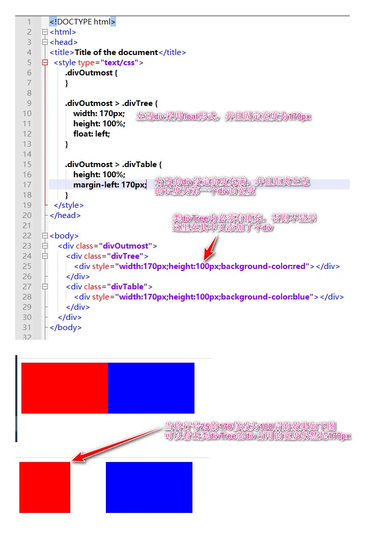
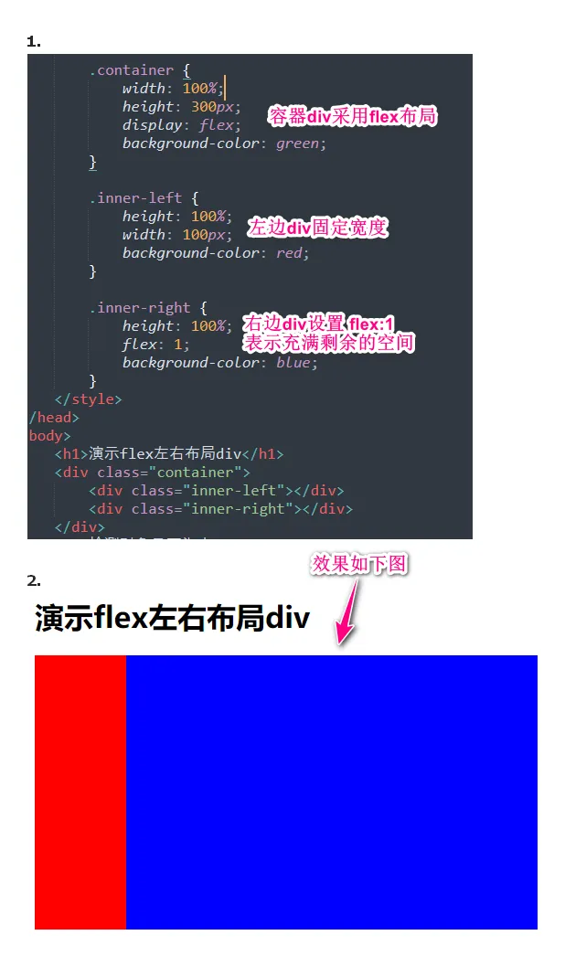
一行内多div
实现效果是两个div显示在一行内,左边的div固定宽度且纵向充满,右边的div自适应,即横向充满且纵向也充满
内层 div 水平居中
<div id="app" style="position: absolute;width: 100%;height:100%;background-color: red;">
    <div id="frame" style="background-color: blue;height: 100%;width: 500px;margin: 0 auto">
        <h2>{{title}}</h2>
    </div>
</div>
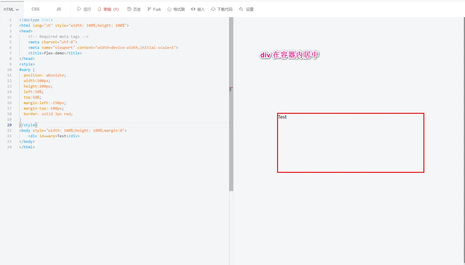
内部 div 水平、垂直居中
<template>
  <div class="login">
    <div class="form-panel"></div>
  </div>
</template>

<script lang="ts">
import { defineComponent } from 'vue'
import { ccRequest } from '@/service'

export default defineComponent({
  setup() {}
})
</script>
<style scoped lang="less">
.login {
  position: absolute;
  width: 100%;
  height: 100%;
  background: url('../../assets/img/login_bg.jpg');
  background-repeat: no-repeat;
  background-size: cover;
}

.form-panel {
  position: absolute;
  top: 0;
  bottom: 0;
  left: 0;
  right: 0;
  margin: auto;
  background-color: red;
  width: 500px;
  height: 500px;
}
</style>
div内左右布局显示按钮
下面 css 中的 flex 表示用 flex 布局,justify-content 表示水平方向中间留空。即如果外层 div 宽度过大,填充两个按钮后会有空白,则空白全都集中在两个按钮中间。 下面的外层 div 适合放在一个 div 内部专门用来控制两个按钮的大小和布局。这里外层 div 要设置 height 是为了控制按钮的高度。如果外层 div 高度过大则内部按钮的高度是自适应的 - 也会显示为高度很大
<div style="width: 200px;height:80px;display: flex;justify-content: space-between;">
  <a class="easyui-linkbutton" data-options="iconCls:'icon-print',iconAlign:'bottom',size:'large',onClick:print_jz">净重折率</a>
  <a class="easyui-linkbutton" data-options="iconCls:'icon-print',iconAlign:'bottom',size:'large',onClick:print_ms">米数折率</a>
</div>
悬浮固定位置
给div设置id 为 center,样式代码如下
#center {
    width: 200px;
    height: 200px;
    border: 2px solid black;
    background-color: white;
    position: fixed;
    left: 50%;
    top: 50%;
    margin-left: -100px;
    margin-top: -100px;
}
固定位置第二个案例 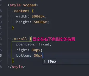
制作背景色渐变的按钮
<!doctype html>
<html lang="zh">
<head>
	<meta charset="utf-8">
	<title>easyui - layout</title>
	<meta name="viewport" content="width=device-width, initial-scale=1">
	<style type="text/css">
@keyframes arrow_move {
   /* 开始状态 */
    0% {
        left: 130px;
    }
	/* 结束状态 */
    100% {
        left: 140px;
    }
}
@keyframes color_move {
    /* 开始状态 */
    0% {
        background-position: 0% 0%; /* 水平位置 垂直位置 */
    }
    50% {
        background-position: 50% 0%;
    }
	/* 结束状态 */
    100% {
        background-position: 100% 0%;
    }
}
.div_btn {
    width:180px;
    height:60px;
    border-radius: 10px;
    position: relative;
    background: linear-gradient( 90deg, #373d42 0%, #2679dd 50%, #373d42 100%);
    background-size: 400% 100%;
    animation: color_move 5s infinite ease-in-out alternate;
    cursor: pointer;
}
.div_btn:hover {
    background: #2679dd;
}
.div_btn:active {
    background: #373d42;
}
.div_btn > .div_btn_content {
    /* background: yellow; */
    width: 50px;
    text-align: center;
    position: absolute;
    left: 50%;
    top: 50%;
    transform: translate(-50%,-50%);
    font-size: 20px;
    color: #fff;
    font-weight: bold;
}
.div_btn > .arrow {
    /* background: green; */
    width: 20px;
    text-align: center;
    position: absolute;
    font-size: 30px;
    color: #fff;
    top: 46%;
    transform: translateY(-50%);
    left: 130px; /* 移动130~150px */
    /* 调用动画 */
    animation-name: arrow_move;
    /* 持续时间 */
    animation-duration: 1s;
    /* 无限播放 */
    animation-iteration-count: infinite;
}

    </style>
</head>
<body>
	<div class="div_btn">
		<div class="div_btn_content">净重折率</div>
		<!-- <div class="arrow">»</div> -->
	</div>

	<div class="div_btn">
		<div class="div_btn_content">米数折率</div>
		<!-- <div class="arrow">»</div> -->
	</div>

</body>
</html>
水平居中文章
在知乎的文章是:https://www.zhihu.com/question/472137762/answer/1997575705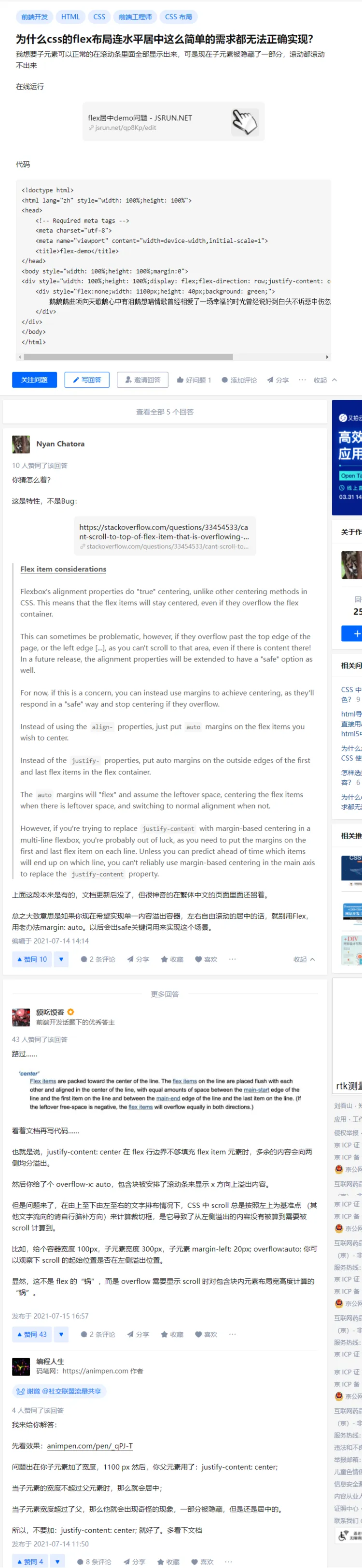
垂直居中文章
知乎的文章: 为什么css的连div垂直居中这么简单的需求都无法正确实现? - 知乎
div在容器内居中显示
div 内元素右对齐
下面代码 logout-container 是 div 的类名称
.logout-container {
  height: 100%;
  display: flex;
  justify-content: flex-end;
}
div 内元素垂直方向居中
.logout-container {
  height: 100%;
  display: flex;
  justify-content: flex-end;
  align-items: center;
}
垂直置底
在 table-cell 模式下通过 bottom 置底
.company {
  width: 100%;
  height: 100px;
  color: #0083d0;
  font: 25px bold;

  display: table-cell;
  vertical-align: bottom;
}
div 通过 margin-left 控制左边距离
设置为 inline-block 后在通过 margin-left
.login-panel {
  width: 400px;
  height: 400px;
  padding: 30px;
  background-color: #fff;
  border-radius: 10px;
  margin-top: 90px;

  display: inline-block;
  margin-left: 1000px;
}
水平布局2个div
显示滚动条
overflow: auto;